Usability Study
This was an academic project where I conducted a full usability study of Brandon Sanderson’s website.
“This was fun. I never knew websites were tested like this. The site had a great look and for the most part it was easy to use.”— User Comment
Website Usability
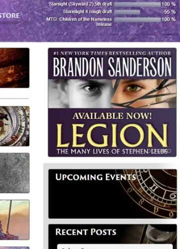
Brandon Sanderson’s site at time of Usability Study
Context
Brandon Sanderson is an award winning and New York Times best-selling author. I conducted this usability study to test the overall usability of the site. I focused on how easily users could find information for:
In-progress/upcoming works
Newly released works
Past works
How to purchase Brandon Sanderson’s books
Newsletter signup
Based on the results of the user study I found a good overall usability of the site. I identified few navigation issues, the most significant issue was the users ability to locate the completion section for in-progress/upcoming works and finding specific works within the website.
The Fix
I suggested that the site create a more noticeable Completion and Search bar by changing the color of the background or font to help it stand out from the rest of the navigation bar.
Add a search bar at the top of the “Books” tab so users would be able to search for a specific book title versus having to navigate through each book series to find the book.
Add an easy newsletter subscription sign up link on the main page on the right side menu to help users find it more easily. I suggested that they keep the newsletter subscription sign up link under the “About Brandon” tab to give users many ways to find it.
My Input
Evaluated existing website to find potential pain points
Created usability study methodology
Conducted usability study
Evaluated usability study results
Proposed recommendations for improvement
Wireframes
Homepage Wireframe
Book Menu Wireframe


